LifeSync
CASE STUDY
Role: UX Researcher,
UX Designer,
UX Writer,
UI Designer
Team: Designer : Archana Singh
Tutor : Gabriel Corá
Mentor : Candice Yee
Duration: 5 Months
Tools: Figma, Adobe CC, Marvel, Balsamiq, Optimal sort, Lyssna
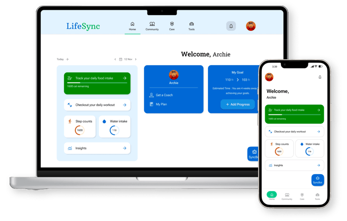
LifeSync is a fitness portal designed to empower health-conscious individuals. LifeSync not only enables users to record their health and medical data but also seamlessly integrates fitness, medical management, and a supportive community into one intuitive platform. Whether you're tracking your workouts, managing your medical appointments, or engaging with a vibrant community, LifeSync is here to make your health journey effortless. With a user-friendly interface and thoughtful design, LifeSync is committed to promoting a healthier lifestyle by providing accessible and personalized solutions.
Below, I explained how I planned to incorporate the design thinking process into the project's development.
PROBLEM STATEMENT
Health enthusiasts require a way to record their health and medical information, as well as access wellness resources, because they prefer a one-stop shop for managing their well-being. We will know this is true when we see a 60% user retention rate within 6 months of our app's launch.
POTENTIAL SOLUTION
An app that allows health enthusiasts to easily record their health and medical data while maintaining data security and preventing information loss. The app will integrate seamlessly with devices to provide comprehensive well-being tracking. It will provide easy access to assistance, especially when scheduling appointments. The interface will prioritize simplicity and intuitiveness over unnecessary pop-ups.
To solve a problem, I needed to understand it. Therefore, I conducted a competitive analysis of potential competitors to understand users' needs and challenges with existing apps.



COMPETITIVE ANALYSIS
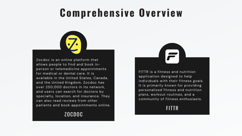
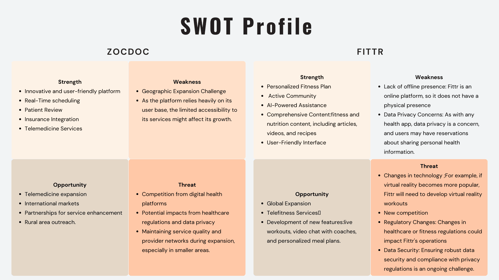
In exploring health and wellness apps, attention was given to the offerings available to users. Fittr and Zocdoc were chosen as competitors for closer examination due to their popularity and unique features. The findings will be presented in a comprehensive overview, outlining the strengths, weaknesses, opportunities, and threats of each competitor. This analysis aims to provide insights into how LifeSync can be effectively positioned in the market.
To truly understand potential users, I observed them through user interviews. These interviews provided valuable insights into different age groups, which was a priority for me.
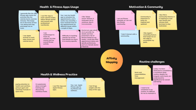
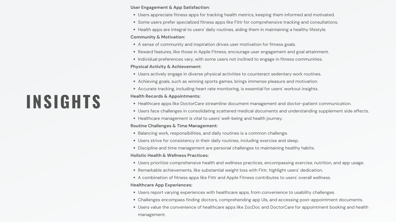
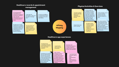
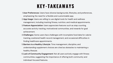


I have conducted interviews with three potential users, and an affinity map was created by grouping the observations, pain points, and thoughts gathered from the interviews.


USER RESEARCH
Now that I have gained insights into the competitive market, my goal is to develop a deeper understanding of how individuals of varying ages engage with digital platforms. This knowledge will be crucial for designing an intuitive app that caters to a wide range of users. I'll be identifying their pain points, exploring their interests, and uncovering motivations through user interviews to gather qualitative data.
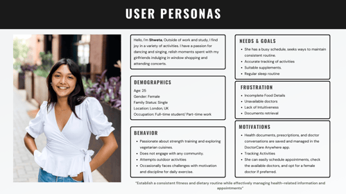
My goal was to step into the shoes of my potential users. With all the information from the previous stage, I created primary personas, representing typical users.
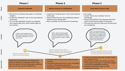
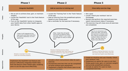

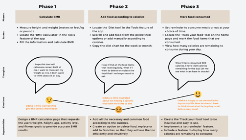


To understand the experience a user goes through while interacting with a product, I have created user journey maps focusing on specific tasks they perform.

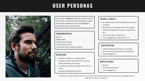


USER PERSONA
I created two personas—Odeka and Shweta—using both qualitative and quantitative data obtained from user research. These personas represent the top two target groups and will serve as a reference point throughout the design phase, ensuring that the solution I create is tailored to meet their needs and goals.
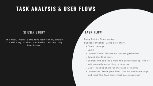
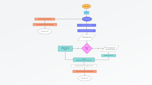
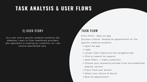
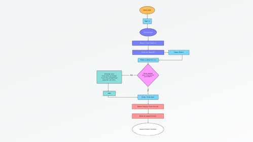
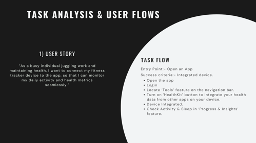
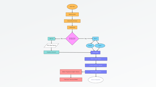
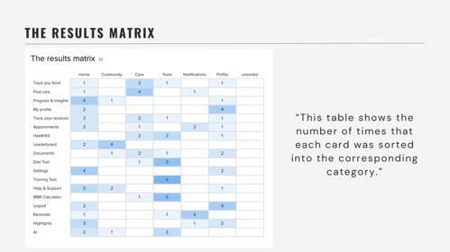
I applied my creative thinking to find practical solutions that met the diverse needs of potential users. To accomplish this, I created user flows that showed how users would interact with LifeSync. Card sorting also helps organize functions into logical categories.






USER FLOW
When Creating user flows, I carefully selected user goals that align with the needs of our target personas.
Device Integration: Enhancing the user experience by seamlessly integrating devices for tracking health data.
Healthcare Provider Search: Simplifying the search for healthcare providers based on individual needs, ensuring a personalized healthcare journey.
Daily Food Intake Tracking: Promoting healthier eating habits and overall well-being through easy tracking of daily food intake.




INFORMATION ARCHITECTURE
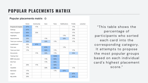
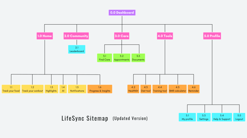
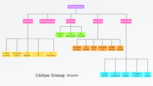
The site map was created to represent the information architecture of LifeSync. It was designed with the user flows in mind, which were created during user research. I reduced cognitive load for users by conducting a card sorting exercise, revising the site map, implementing an informative onboarding process, and ensuring a simple design with intuitive icons and navigation.
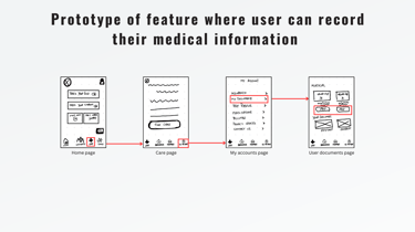
I put my ideas into action by focusing on what users needed and the challenges they faced. I started with simple paper sketches and then used Balsamiq to create detailed digital wireframes.
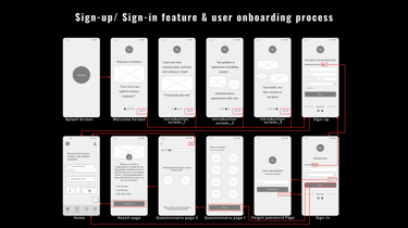
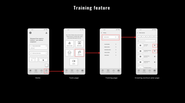
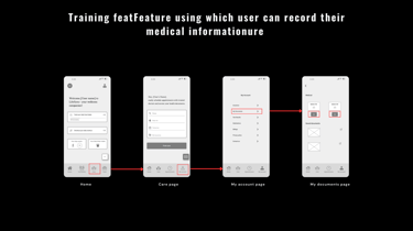


Mid-high-fidelity prototypes were created after the paper sketch for the same three key features of the LifeSync app, including the onboarding process.
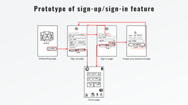
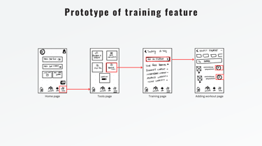


WIREFRAMES & PROTOTYPE
Paper sketches were created for the three key features of the LifeSync app, keeping the information architecture in mind.
Before moving forward, I conducted a usability test to evaluate the first stage of my design. I gave participants specific tasks while observing their interactions.


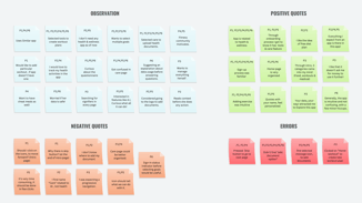
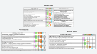
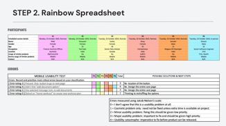


An affinity map and rainbow spreadsheet were generated to capture results and gather insights for wireframe iterations.
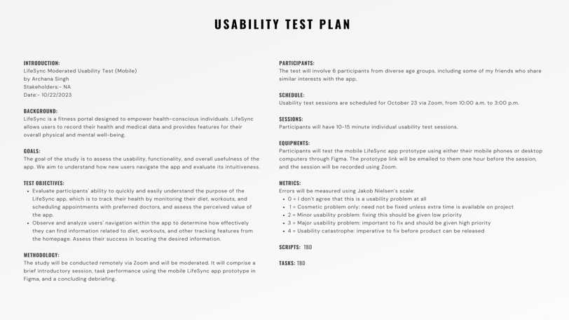

USABILITY TESTING & RESULTS
I conducted a moderated-in-person as well moderated-remote test with 6 participants to test the usability of LifeSync. It helped me gather crucial insights and feedback on the performance of LifeSync.
After rating errors using Jakob Nielsen's scale, I identified possible solutions for high-fidelity wireframe iterations.
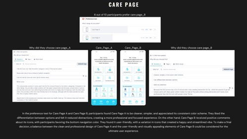
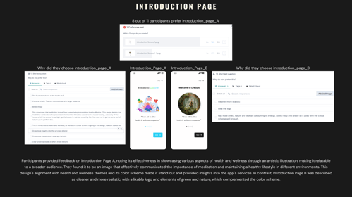


I conducted preference tests on 10 participants for the Care and Introduction pages of LifeSync. These insights play a pivotal role in shaping the app's color scheme and overall user experience
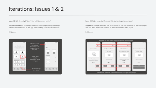
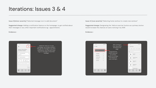


ITERATIONS
I revised the prototype to reflect the solutions that I have listed in the report.
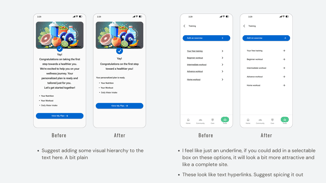
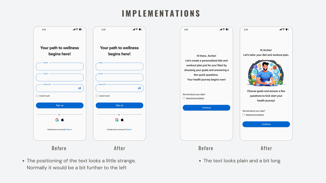
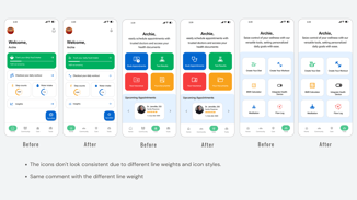


I believe in continuous improvement, treating design as an iterative process open to enhancements. After having my design reviewed by peers and receiving valuable feedback, I implemented suggested changes, addressing identified gaps. This feedback provided clear direction for decision-making.
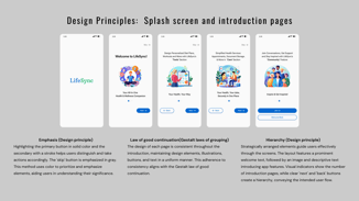
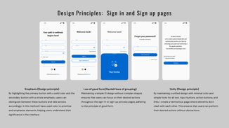
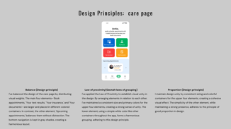


FINAL PROTOTYPE
In designing the high-fidelity prototype of LifeSync, I applied the Gestalt principle to enhance the overall user experience. By considering the principles of similarity, proximity, and closure, I ensured that design elements were visually cohesive and formed meaningful relationships. This approach allowed for a clear and intuitive interface where users could easily identify patterns, relationships, and key information.
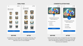
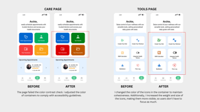
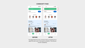
When designing a product or service, I prioritized accessibility. I followed the Web Content Accessibility Guidelines (WCAG) using tools from the Figma community.
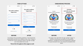


DESIGN FOR ACCESSIBILITY
I implemented the design in accordance with the WCAG guidelines.
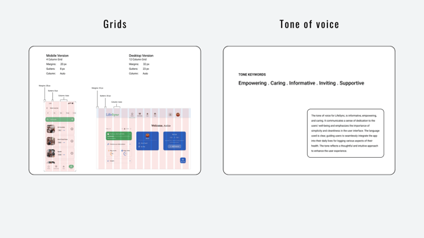
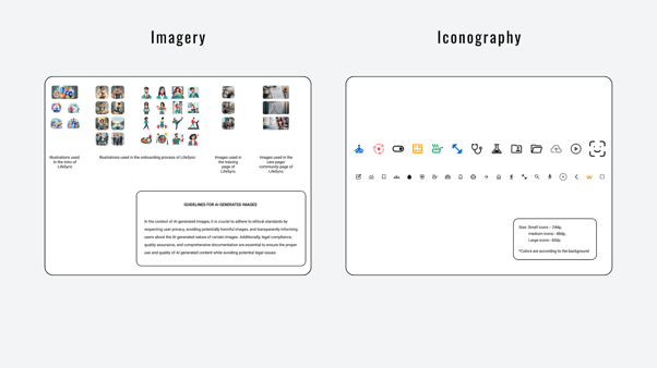
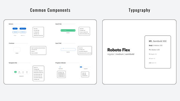
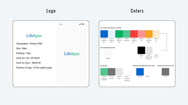
I created a style guide to summarize the brand LifeSync.


UI DESIGN
HIGH-LEVEL PLAN FOR HOW I WILL CONTINUE TO ITERATE ON MY APPLICATION IN THE FUTURE.
As LifeSync transitions through its high-fidelity phase, the focus turns to refining existing features and addressing identified areas for improvement based on user feedback and hypotheses.
Initial usability testing successfully validated the intuitiveness of the sign-in/sign-up process.
Next, I'll be looking at the 'Community' and 'Care' sections to make them even easier to use. I want to make sure users can easily connect with others in the community and manage their health information hassle-free.
Another critical aspect is the accessibility of the redesigned UI, which aligns with updated guidelines.
Testing methodologies will involve targeted usability tests, incorporating real-time user feedback to validate these hypotheses.
Furthermore, preference testing will provide insights into user expectations and preferences.
As the high-fidelity design progresses, iterative updates will be implemented over the next three months, ensuring a seamless, user-centric experience.
CLICKABLE PROTOTYPE OF LIFESYNC
VIDEO PRESENTATION OF LIFESYNC'S FUNCTIONALITY
What a thrilling journey!
Here are the biggest key takeaways and insights I've gained during the process:
